Blogs / Responsive Website Design In The UAE: Why It’s Critical For SEO In 2026
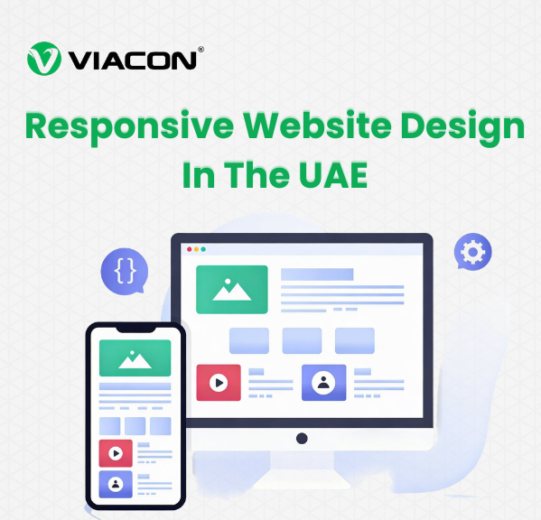
Responsive Website Design In The UAE: Why It’s Critical For SEO In 2026
Responsive website design is no longer optional in the UAE’s mobile-first digital landscape. In 2026, Google prioritizes mobile usability, page experience, and performance for SEO rankings. This blog explains how responsive design improves visibility, user engagement, and conversions while helping UAE businesses stay competitive online.
March 18, 2026
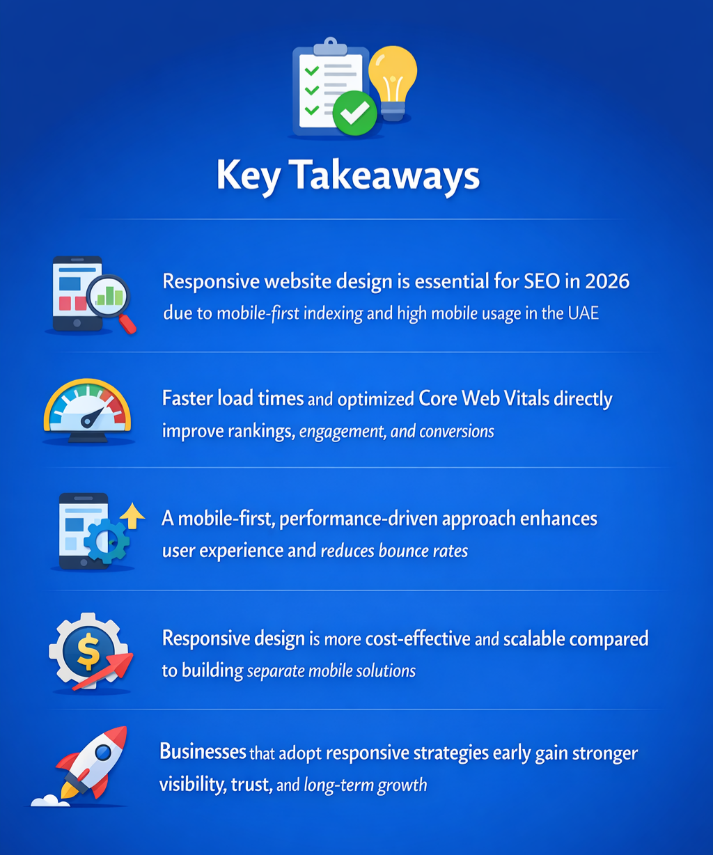
The digitization of the UAE market has been remarkable. With 99% internet penetration and 202% mobile connection compared to the population, mobile-first experiences are no longer optional; they are mandatory.
In this environment, brands vying for visibility and credibility had to rethink their options. Traditional digital marketing techniques are no longer bearing the fruits they once did and are being replaced by mobile-first thinking.
This view is further accentuated by Google and other search engines’ push towards mobile-first indexing.
The rapid growth of UAE digital adoption, combined with Google's mobile-first indexing, has made it essential for businesses to prioritize mobile performance and responsive design.
In this evolution, one change that has caught the eyes of marketers and brands, and for obvious reasons, is responsive web design. It has moved from being a critical design element to a key SEO requirement.
Today, websites that are fast, adaptive, and offer a seamless user experience are getting preference from the search engines, making a crucial shift for the UAE businesses.
What Is Responsive Website Design?
Responsive website design is a modern web development approach that ensures a website automatically adapts to its layout, content, and functionality. The goal here is to deliver an optimal user experience irrespective of all screen sizes and devices, which includes smartphones, tablets, desktops, laptops, and foldables.
Instead of creating separate versions for mobile and desktop, responsive design uses flexible grids, fluid layouts, intelligent breakpoints, and adaptive images to dynamically adjust content in real time.
What Are The Benefits Of Responsive Web Design?
Responsive web design improves SEO performance, enhances user experience, and ensures consistent functionality across all devices. It helps reduce bounce rates, increase engagement, and improve search rankings.
With Google mobile-first indexing, search engines primarily evaluate the mobile version of a website, making responsive design a key factor in visibility and ranking performance.
Key Benefits Include:
Better mobile usability
Faster loading speed
Improved search rankings
Higher user engagement and conversions
How Does Responsive Design Impact SEO?
Responsive design directly impacts SEO by improving mobile usability, page speed, and overall website performance. Since Google follows mobile-first indexing, responsive websites are more likely to rank higher. Businesses investing in SEO-friendly website development often see better long-term results.
Modern SEO performance is heavily influenced by Core Web Vitals, including LCP (Largest Contentful Paint), CLS (Cumulative Layout Shift), and INP (Interaction to Next Paint), which directly impact rankings and user experience.
It Helps By:
Supporting mobile-first indexing
Improving Core Web Vitals
Enhancing crawl efficiency
Reducing bounce rates
Responsive Website Design vs Mobile-Friendly Website Design
Feature
Responsive Website Design
Mobile-Friendly Website Design
Layout
Dynamically adapts to all screen sizes
Scaled-down version of desktop layout
Responsiveness
Intelligent and fluid layout behavior
Basic mobile compatibility
User Experience
Optimized interaction and navigation
Slower and less intuitive experience
Structure
Uses flexible grids and components
Uses fixed-width elements
Performance
Strong Core Web Vitals (INP, LCP, CLS)
Lower performance metrics
Engagement
Higher engagement and retention
Higher bounce rates
Experience
Context-aware and adaptive
Limited personalization
SEO
Highly competitive and optimized
Only SEO compliant
Is it cheaper to build a responsive site or a separate mobile app for my Dubai business?
Building a responsive website is considerably cheaper than creating a separate mobile application. For the former, all you need to do is undertake a redesign job, but for the latter, you have to start from scratch, which will require more investments in terms of time and money. And, when it comes to post-launch expenses, websites are traditionally cheaper to maintain than mobile apps.
Why Responsive Website Design Is Critical For SEO In 2026
In 2026, mobile-responsive website design goes far beyond visual adaptability. It also plays a critical role in developing SEO-friendly websites with faster page load times, stable layouts, greater intuitiveness, improved crawl efficiency, and higher user engagement.
Here is more on how a truly responsive website helps a business beyond appearance -
(i) Improves Brand Visibility And Trust
One of the biggest reasons behind preferring responsive web design is improved brand visibility and trust. Mobile performance, usability, and page load speed are key ranking factors in 2026, and a better SERP position directly translates into improved brand exposure.
At the same time, the high ranking on search results increases brand trust and credibility, which leads to better customer acquisition and loyalty in the long term.
(ii) Drives Higher Conversion
As the Dubai market reaches saturation in mobile phone adoption and internet usage, every business website must be mobile-compatible for brands to survive the stiff competition. Therefore, a fast, adaptive, and intuitive website design lowers friction points in the buyer journey and makes it easier for users to browse, enquire, and make a purchase.
As a result, the brand receives higher organic traffic, lowers cart abandonment, improves conversion, and ultimately increases revenue. This is where combining responsive design with strong UI/UX optimization strategies plays a crucial role.
(iii) Improves Customer Retention
A responsive website design plays a key role in customer retention. The seamless navigation, paired with quick loading time and intuitive layouts, is now encouraging deeper site exploration. This proves crucial for lead nurturing and customer retention.
(iv) Increases Voice Search Compatibility
The rise in mobile phone adoption in the UAE has also increased the popularity of voice search. So, in 2026, a business website must be compatible with voice search to maintain visibility in this emerging trend and find new and untapped opportunities.
(v) Future-proofs The Business
As search engines like Google are already moving towards a mobile-first indexing policy, opting for a responsive web design and development future-proofs the business. It continues to reach the audience through the most popular method of search and finds success in the years to come.
Can I keep my current design but make it 'responsive' without a full rebuild?
You can easily keep the current design and make the website responsive by retrofitting updated CSS. This effort preserves the site's existing visual identity while improving its mobile usability, performance, and SEO readiness.
How To Create A Responsive Website (Step-by-Step)
Creating a responsive website starts with flexible layouts that adapt to different screen sizes instead of fixed-width structures. Developers use media queries to control how content behaves across devices such as mobile, tablet, and desktop.
Images are optimized using compression and lazy loading techniques to improve speed. Adding the viewport meta tag ensures proper scaling across devices, while improvements in Core Web Vitals help maintain speed and stability.
Optimizing for Core Web Vitals such as LCP, CLS, and INP ensures that the website delivers fast loading, visual stability, and smooth interaction across all devices.
Key Focus Areas:
Flexible grids and layouts
Media queries for breakpoints
Image and speed optimization
Cross-device testing
Responsive Design Best Practices In 2026
In 2026, responsive design requires a mobile-first approach where websites are designed primarily for mobile users and then scaled upward. Touch-friendly navigation and fast loading speeds are essential for usability. Businesses that align this with content marketing services often see better visibility and engagement.
Best Practices Include:
Mobile-first design approach
Touch-friendly navigation
Performance-focused loading
Voice search readiness
Responsive Design Checklist For UAE Businesses
A responsive website should meet performance, usability, and SEO standards, especially for businesses targeting competitive markets like the UAE.
Loads under 2 seconds
Mobile-first design applied
Optimized images and media
Smooth navigation across devices
No layout or scrolling issues
With experience in building websites across industries such as cybersecurity, ecommerce, and enterprise services, responsive strategies supported by tools like Google Lighthouse and Core Web Vitals help deliver measurable improvements and stronger performance outcomes, especially when aligned with ecommerce development solutions.
Real-World Responsive Website Example: What High-Performing UAE Websites Do Differently
Let’s understand the impact of this new trend in web design with a real-world responsive website example. A cybersecurity business in the UAE primarily caters to SMEs and MSMEs in Dubai, Abu Dhabi, and the wider GCC region.
The improvements were aligned with Core Web Vitals benchmarks and optimized based on insights from Google PageSpeed Insights and Lighthouse reports.
The company was operating in a highly competitive market and relying heavily on organic search, paid campaigns, and thought leadership content for lead generation.
However, The Website Continues To Suffer From -
Poor mobile usability.
Slow loading speed across 5G networks.
Complex navigation on smaller screens.
High bounce rate from mobile users.
Weak Core Web Vitals performance.
As a result, despite the strong domain authority, the site struggled to find its place on the SERP.
To resolve this issue, the company opted for a responsive website designstrategy that completely transformed its online presence. Here is how things unfolded:
Adaptive Grid System: The website was shifted to an adaptive grid framework that dynamically adjusted the website layout based on screen size and device orientation. This move improves readability, content engagement, and lowers bounce rates.
5G Ready Performance: With most users in the UAE having access to 5G networks, the website was optimized accordingly for instant loading. Image compression, smart lazy loading, CDN delivery, and server-side rendering were primarily used for this modification. As a result, the page load time reduced to below 1.5 seconds, improving Core Web Vitals and subsequently the organic ranking.
Conversion-driven Mobile UX Flow: The buyer journey was completely redesigned, keeping mobile phone users in mind. Comparatively simpler navigation, more visible and prominent demos and consultations, better-optimized lead forms, and scroll-based content sequencing were added, leading to an over 40% increase in conversion rate.
Better Touch-optimized Navigation: The usability of the website was improved through touch-optimized navigation. The likes of thumb-friendly menus, gesture-based interactions, and minimalist interface patterns are used to increase session duration, engagement, and build better trust signals.
The Outcome
Metric
Before
After
Mobile load speed
4.8s
1.3s
Bounce rate
68%
29%
Mobile conversions
3%
32%
Core Web Vitals
Failing
Passing
The Deployment Of A Performance-focused Responsive Website Helped The Cybersecurity Firm To Achieve -
Higher mobile rankings across competitive keywords.
Stronger brand authority.
Increased enterprise lead volume.
Lower cost-per-acquisition.
Improved marketing ROI.
Viacon Digital played the role of a catalyst in helping the cybersecurity firm realize this transformation. With a clear understanding of the business and carefully curated strategies, Viacon Digital developed a high-performance responsive website that influenced business growth and secured its future for the years to come.
Frequently Asked Questions:
Q1. Is responsive design important for SEO?
A: Yes, it improves mobile usability, page speed, and rankings.
Q2. What is mobile-first indexing?
A: Google primarily uses the mobile version of a website for ranking.
Q3. Is responsive design expensive?
A: No, it is more cost-effective than building a mobile app.
Q4. Does responsive design improve conversions?
A: Yes, it creates a smoother user experience and increases conversions.
Why Responsive Website Design Is Essential For UAE Businesses In 2026
To sum up, responsive website design for the UAE market in 2026 is no longer just a good-to-have. It is a prerequisite for businesses across the region, given the rapid digitization and rising market competition. A high-performing, responsive website directly influences the brand's visibility and conversion potential, thereby affecting its revenue growth.
As UAE digital adoption continues to grow and Google mobile-first indexing becomes the standard, responsive website design will remain a critical factor in long-term SEO success.